The short answer
When paint matches a counter, fabric or factory-finished panel under one light but separates under another, review the materials together before ordering. Ask the designer or supplier whether metamerism explains the difference. Decide which operating light conditions the match must satisfy, then choose an accepted combination or an intentional contrast.
Identify the pair that is supposed to match
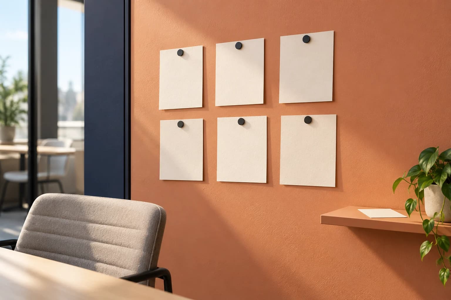
For a Saskatoon reception refresh, write down the relationship the owner expects: painted wall to laminate counter, trim to factory-finished panel, or wall to upholstered seating. Bring the actual material samples together. A list of similar colour names does not tell separate suppliers which two surfaces must work as a pair.
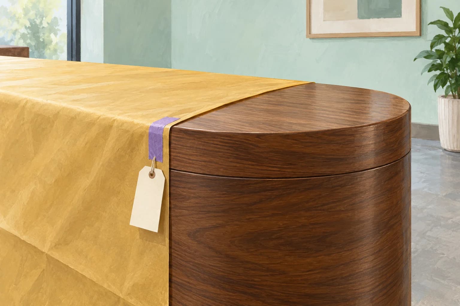
Decide which component is fixed. An existing reception counter may be staying while the paint remains open for selection. Alternatively, both materials may still be unpurchased. That distinction changes the available choices. Identify who can approve the combined appearance before one trade places an order that removes the other trade's options.
Review the mismatch under each operating light condition
Sherwin-Williams explains metamerism as a pair of colours matching under one light source but differing under another. Its discussion connects the effect to differing colour formulations and distinguishes it from one colour appearing to shift with illumination. That is a reason to assess the pair, not proof of a fault in either material.
Ask the responsible design reviewer to compare representative samples in the intended location with the planned lighting. Include the conditions the business actually uses, such as daylight at reception and the normal evening lighting scene. Record which combination looks acceptable in each condition. If the permanent fixtures are not installed, identify that limitation and agree when a final comparison can occur.
Keep sheen, texture and viewing position in the record so the discussion does not assume every visible difference has the same cause. Photographs can identify samples and locations, but the purchasing decision should refer to the physical comparison. Ask suppliers for help resolving the observation rather than requesting repeated tint changes without a shared reference.
Reference: Sherwin-Williams: metamerism and material colour matching
Choose a relationship the owner can accept
The review can lead to several purchasing decisions: accept the observed variation, request a different paint sample, reconsider an unpurchased adjoining material, or choose a deliberate contrast. Have the owner select the outcome with the designer. Do not describe a close daytime match as an exact match under every light.
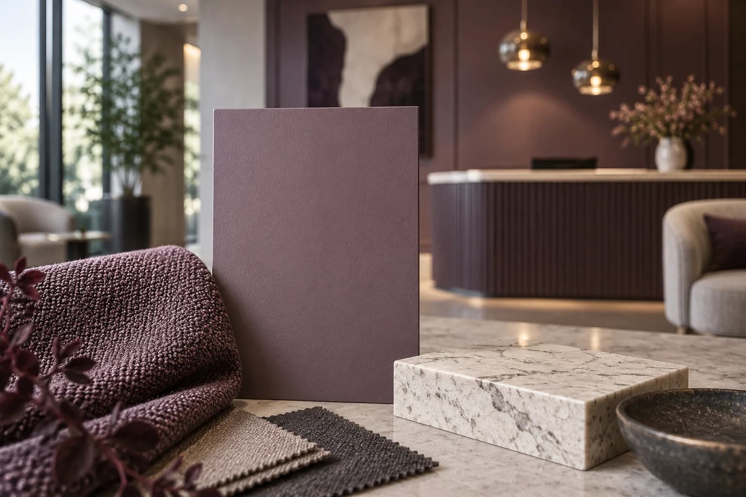
In an illustrative reception, a mauve wall sample could coordinate with retained upholstery in daylight but look noticeably different during evening appointments. The owner might accept both appearances or choose a clearly contrasting wall colour. The decision concerns that material pair and its operating conditions; it does not establish that the painter used the wrong paint. This example is not a PainterzRus project record.
Release the coordinated orders together
Keep the accepted paint sample, adjoining material reference, lighting conditions and decision in one approval record. Share the same reference with the parties placing the separate orders. State which unresolved item holds purchasing so a paint approval does not accidentally authorize an unreviewed replacement counter or fabric.
If a material, finish or lighting selection changes, return the combination to the reviewer. Retain the physical references through installation and final comparison. Bring the coordinated samples to a commercial interior painting discussion with PainterzRus and confirm the proposed scope. Sample coordination does not promise an exact match between every material or establish specialist colour-measurement services.
Keep this for your project
Your planning checklist
- Name the two materials expected to match and identify which is fixed.
- Compare representative physical samples under normal operating lighting.
- Record acceptable and unresolved appearances for each condition.
- Choose an accepted pair, documented variation or deliberate contrast.
- Connect separate purchase orders to the same approval record.
Does a match at the paint counter settle the match in my reception?
It establishes a comparison under those viewing conditions. Review the actual paint and adjoining material together in the intended space before committing to a coordinated purchase. If the final lighting is unavailable, keep that part of the approval open.
Put the planning into practice
Download the free quote comparison kit to compare the work behind each price, or build your commercial project brief before requesting an estimate. No email required to use either tool.
Discuss your commercial project
For offices, retail spaces and other commercial interiors, review the surfaces, access and protection questions covered by our commercial interior painting in Saskatoon service.
Have a location and a rough scope? Request a commercial painting quote with the details you have. Access, timing and project requirements can then be reviewed for your property.
A planning guide from PainterzRus, a commercial painting business in Saskatoon. Not a site-specific coating specification, safety assessment or price quotation. Confirm requirements for your property before work begins.