The short answer
Before giving commercial doors, frames and surrounding walls one coordinated palette, ask the responsible designer which elements must remain visually distinct. Obtain a location-specific contrast review alongside the colour selection. An attractive combination of swatches does not establish that people can identify the intended doorway in the finished space.
Identify the visual cue before changing the palette
A Saskatoon office refresh can include a request to make door frames disappear into the new wall colour. Before approving that change, ask the building representative whether the existing distinction forms part of its wayfinding or accessibility design. Gather available finish schedules and design records. Existing colours are useful evidence of what is present, but they do not prove the current arrangement has been assessed.
Prepare an opening list with the door face, frame and immediate wall identified separately. Ask the designer which relationship should help a visitor recognize each opening. Include retained flooring and signage in the review context without adding them automatically to the painting scope. The first deliverable is a clear design question for each affected location.
Request contrast evidence for the paired surfaces
The Canadian Museum for Human Rights explains contrast using the light reflectance values of an element and its background. Its own design guide describes using contrast and directed lighting to distinguish surfaces in galleries. This provides an example of a functional design purpose beyond decorative preference; the museum's requirements are not a specification for every Saskatoon commercial building.
Ask the project's qualified designer or accessibility reviewer to identify the applicable requirements, assessment method and supporting material information. Obtain the proposed paint references and any light reflectance data requested for both sides of the relationship. If an existing finish remains, ask how the reviewer will establish its relevant properties rather than substituting a remembered colour name.
Keep hue, sheen and lighting visible in the discussion, but let the reviewer determine their significance. Do not approve a pair solely because one swatch is blue and the other is green. A digital rendering can communicate the design idea; ask separately what evidence supports the finished physical relationship. This guide sets no contrast threshold or legal compliance conclusion.
Reference: Canadian Museum for Human Rights: contrast and light reflectance in its design guidance
Approve a relationship that survives the actual scope
Have the designer identify a representative doorway for reviewing the proposed finishes together under the intended operating lighting. Agree who provides the sample, who reviews it and what remains provisional if the permanent lighting is unavailable. Record the accepted combination by opening reference. Colour approval and the functional review should each have an identifiable decision owner.
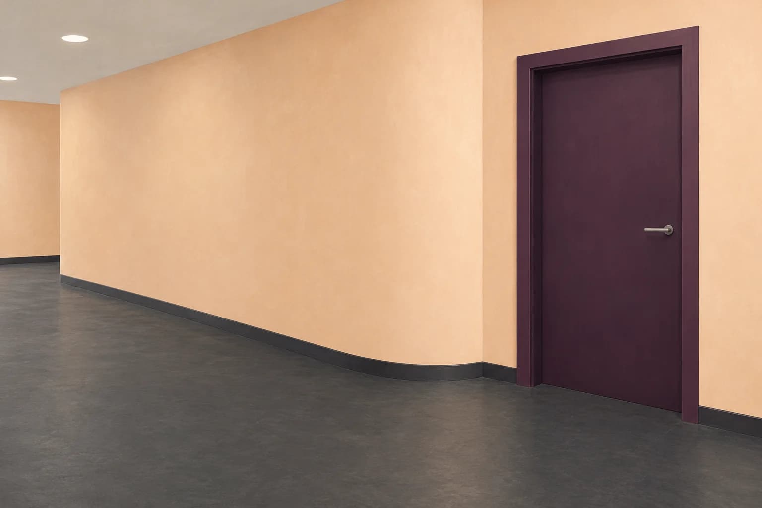
In an illustrative office, the owner might retain a dark door while changing its surrounding wall to a deeper brand colour. That proposal needs review of the new pair even though the door receives no work. If the pairing is unsuitable for the design brief, ask for a revised wall selection or a separately priced change to the door or frame. Do not assume which component must change.
Define the approved paint boundary on the contractor's opening list. Keep labels, hardware and building systems under their existing protection requirements. If a finish cannot be supplied as approved, return the replacement pair for review before application. A close-looking substitute should not inherit a technical decision without the responsible reviewer's agreement.
Hand over the paired finish record
At completion, reconcile the actual door, frame and wall finishes with the reviewed schedule. Ask the designated reviewer to close any outstanding contrast question using the agreed assessment. Keep any unresolved item visible even if the owner likes the overall colour. An attractive completion photograph does not replace that decision.
Save the paired references for later maintenance so a future repaint of only one surface prompts another review. Bring the released finish schedule to a commercial interior painting discussion with PainterzRus and confirm the offered scope. The business is not represented here as an accessibility assessor, lighting designer or building certifier.
Keep this for your project
Your planning checklist
- Identify which opening elements need a functional contrast review.
- Assign the applicable requirement and assessment to the designer.
- Review the door, frame and surrounding wall as a relationship.
- Resolve retained finishes and substitutions before application.
- Preserve paired finish records for future maintenance.
Can a wall-only repaint change the reviewed doorway contrast?
Yes, the surrounding finish is part of the relationship. Ask the responsible designer to review the new pairing even when the door remains untouched. Do not infer accessibility compliance from a colour choice alone.
Put the planning into practice
Download the free quote comparison kit to compare the work behind each price, or build your commercial project brief before requesting an estimate. No email required to use either tool.
Discuss your commercial project
For offices, retail spaces and other commercial interiors, review the surfaces, access and protection questions covered by our commercial interior painting in Saskatoon service.
Have a location and a rough scope? Request a commercial painting quote with the details you have. Access, timing and project requirements can then be reviewed for your property.
A planning guide from PainterzRus, a commercial painting business in Saskatoon. Not a site-specific coating specification, safety assessment or price quotation. Confirm requirements for your property before work begins.